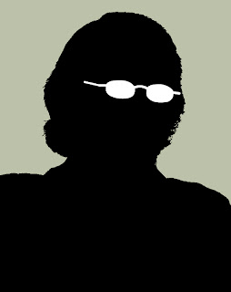
Besides watching a Star Wars marathon and listening to some music, I decided to play around a bit more with Photoshop/Illustrator. I don't know how I came to the decision that I'll try to make a silhouette of my headshot, but I decided that I'll try to make a silhouette of my headshot.
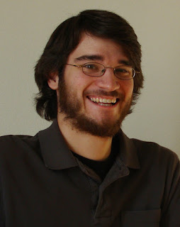
You've seen this picture before, it's over there ---> to the right. It's the headshot I sent in to the job that required me to be clean shaven everyday. I like this picture, because my beard looks good and my hair flows perfectly. This picture would make a simple silhouette because of the amount of contrast it already presents.
I searched for a tutorial of how to do silhouettes, and then followed some steps that got me to just the black and white image. It essentially what I was aiming for.
We get that, just the black on white. It required some touching up of the hair, and if I spent some more time on it, I could get a better representation of how wavy and flow-y my hair can get. But I really wasn't aiming for that. And I don't really have a mouse/setup that could help my precision in that matter.
My next idea was to personalize it a little more, and add some glasses. That led me back into Illustrator where I can easily work with the all-mighty pen tool. The background was the last touch, and I went with some gray of sorts. It's gray. I like gray.
And that is what I ended up with. The glasses look a little too sharp, I think. But if you were to just look at that silhouette without previously seeing the original or knowing who it was, could you guess it was me?
Sunday, November 27, 2011
Saturday, November 19, 2011
6th Annual Barth/Wing Bonspiel
Adam and I have gone curling every year since the Winter Olympic Games inspired us back in 2006. We started off with just six people on one sheet and the Annual Barth/Wing Bonspiel has grown ever since. I suggested we make t-shirts for last year's event, but Adam shot that down.
Something he wouldn't be able to stop, however, was an official logo for this year's event. Yup, a semester of training has made me good enough to start making official logos for big-time events. I even did this pro bono.
I had the image in my mind of what it should look like, and I started there. It was just a simple square shaped image, and I wanted text on the top and the side which shared the common "B" from the title. Then I would place the image (which hadn't been decided on then) in the space beneath.
Google is a big help when it comes to images. Searching "curling" or "curling stones" or "that one curling girl that posed nude last year" yielded many results, but still not as many as I would have preferred...
Well I stumbled upon a good enough image of a couple of stones in the house and decided to use that as my template for tracing my own stones in Illustrator. After the primary stone was finished, I was happy with the result, but wanted to see what I could produce with adding two more stones into the mix. I didn't like it as much.
So I balanced out the text and the images into what worked best, and have a black border around the whole thing to help simplify it and keep it together.
You are waiting for what it looks like, eh?
Ta da! It's my first work in Illustrator as a college grad. It helps to keep these skills in order, because that pen tool can be a tricky little fellow to master. I hope you like it and that it inspires you all to go curling!
Monday, October 10, 2011
Here you go Heidi
Dear Heidi,
I'm updating my blog.
Love,
Tim
P.S. Here is the actual post:
I (re)drafted my fantasy hockey team tonight. It was magical. For the 433rd straight time, I have drafted Roberto Luongo as my number one pick. Lots of iffy moments in the middle, and pleasantly grabbed Michal Neuvirth with my last pick. Yadda yadda yadda, I expect to defend my championship title and go back-to-back this year.
What else? Well, I've been unemployed and living at home for the past month. I'm looking for jobs, of course, and aiming high. Specifically I'm trying to keep with what I had done this past summer and I want to get into media relations in the sporting world. Ideally I want to land a spot as a media relations manager/coordinator for a sports team. What sport? What team? It really doesn't matter. There are two really great sounding positions that I have applied for and still waiting to here back from.
I've been willing to go anywhere in the country, and I've been looking for anything. After traveling over the southeast region of the country this summer, I really enjoyed adventuring to places I had never been before. I am positive I will hold that same sort of enthusiasm for wherever I might end up, too.
Is it because I want to finally become a productive member of society and step foot into the real world? Probably. Or is it because I've been unemployed and living at home for the past month? A little bit of that.
What is great about being at home, though, is the time I get to spend with my nephew, Oscar. I didn't get to meet him until he was three months old AND I was away all summer, so I think I am making up for all of that time now. My sister definitely loves to have another set of helping hands here, and really enjoys that I get stuck changing poopy diapers.
Moving forward, I still haven't really unpacked a whole lot of my stuff here. It took me about 3 weeks to finally pick cloths out of a hamper and put them into a dresser. I still have cloths all over the floor, and a bunch of other things just laying in boxes. I think it might be because I am hopeful of getting a job and moving on soon, so I don't want to have to pack everything that I've unpacked.
As a result of that, I just revert back to my boring self and sit at my computer for a big chunk of the day. I might also be playing four or five different video games simultaneously. I might have been looking for a reason to bust out the word simultaneously. And spell it correctly.
I've also run out of worthwhile things to say right now, so I'll go back to watching late-night anime.
Sunday, August 14, 2011
Little Punks
We had our qualifier today, which means that today was the first time in three weeks that I wore my old man shirt. I've had the past two Sundays off from work, but I didn't miss a beat with today's quali. After topping some tents in the pouring rain (which made tent tops the ideal assignment, because I stayed relatively dry) I was half of our registration crew. Yup, two people to check in 100 players.
Shotgun got off on time, and when I say on time, I mean three minutes late. It was still rainy and overcast, but luckily that was the worst of it. We kept playing and the rain held off, mostly.
But I want to mention a couple of things that really irk me about these juniors:
1) The Tiger drop. You know how Tiger Woods would be pissy after a bad shot and drop his club behind him? Well, juniors think it's cool to do that too. For us, it's a violation of our code of conduct. Sometimes warnings, sometimes penalties. I mostly give them a warning the first time and tell them to hold onto their club, but we see this happen a lot.
2) Kids that think they are above this game. Come on now, you are still in high school, you shouldn't expect yourself to make every single shot in golf. You hit one bad, but it isn't the end of the world. Pull yourself together.
3) Boys that expect to reach the green on par 5s in two shots. I was on No. 14 today, which was a timing station, and I was wondering why some of these gap positions were so big. It was because guys would hit their tee shots and then wait for the green to clear. They were still 240+ yards out, with a dog leg, with overhanging trees, with a dozen bunkers between them, and slightly uphill. You won't reach this green in two shots. So what happens? I watch all for of them hit. Bunker. Trees. Short. Bunker. Nobody made it in two. Speed it up you jerks.
4) Boys that pee on the golf course. This really bugs me. I could go on and on about how many times I see guys pee on the course, but nobody wants to read that. (If you do really want to read that, let me know and I will write a separate post.)
However, there are things that I really like to see or hear. And the best ones happened today.
We see a lot of the same players this summer, and during scoring today one of the guys asked me, "So Tim, are you growing your hair out?" I said yes, yes I am. Thank you for noticing!
Another guy asked me, "Tim, you are really letting your sideburns go, huh? I really dig the chops." I told him thank you, and yes I am letting my sideburns go. That is until somebody on staff tells me not to.
And a third player said, "Tim! You're here! You announced me in the final round at Pinehurst and I shot a 73! You were good luck!" I said, thank you, I really am good luck.
Friday, August 12, 2011
Get out of my dreams
And into my car.
We had an easy drive today, from (oh shit, where were we?) Haymarket, Va., to Clemmons, N.C. Left at 8, got here after 2. One of the shorter drives this summer.
I spent most of my time in the truck playing Chrono Trigger, because that game is awesome. I was upset that I forgot certain things in the game, and I accidentally ate the old man's lunch. That means I was found guilty in court for kidnapping the princess (because it shows I have poor morals, apparently).
I also tried to doze off a few times, but I would catch myself and wake back up, doing the whole routine of head slowly drops down, then head quickly pops up.
Well, in one of these little snoozes, I immediately went into some dream about playing volleyball. In this dream, I was up at the net and I was about to put down an over-pass. That meaning, the opposing team was sending the ball over unintentionally and I was going to just jump up and pop it straight down.
Well, I guess I was so into this dream that as I was dreaming of playing the ball down, in real life I raised my left arm as if to actually hit it. That was when I woke myself up and stopped my arm about halfway up.
Yeah, I was really about to raise my arm and throw it down.
Luckily, the other folks in the car were asleep too, and nobody noticed it. But I don't understand how I was so tired after sleeping from 10 p.m. - 7 a.m. And I am sleepy now. It's not even 9 o'clock.
Wednesday, August 10, 2011
Sunscreen
We work in the sun. A lot. I work less in the sun than our ops teammates because our main duties are behind the computer or in front of the world's most unreliable copying machines. But that's no excuse for not wearing sunscreen.
I wear sunscreen mostly everyday. Some days I feel like it's too cloudy or rainy to need sunscreen, but I usually lather up before I go out to follow groups or find my perch to shoot 800+ player photos during the first round. (Yeah, I really do take that many pictures, and of the 800+ we will only use about 5 to post to the website)
I keep sunscreen in my backpack, but one of our sponsors is a sunscreen company, and we put big tubes on the starters tables, and that is where I usually sunscreen up. I encourage the players to wear sunscreen, too. It's practical and reliable. Don't burn, reapply at the turn.
But I am getting quite tan, it seems. More tan than I was last summer, despite me always being outside last summer. The main change is I wore jeans everyday last summer and now I am wearing nut-hugging short-shorts. Seriously, these shorts are tiny.
I also sit in a golf cart a lot, and the left side of my body is more tan than my right. How much more tan? Well, it's funny, really. My left leg is very tan from the knee down to the socks. Then I have ghost-white feet. And the hairs on my knee are blonde from the sun.
Best part? There is a very distinct tan line on my thigh where you can see how short my shorts really are. It's funny.
On days like today (Wednesdays) I know my neck is protected. Not because of the sunscreen, but because I pop my jollar. (Jollar=jean collar. It's a pink shirt and the underside of the collar is denim-blue. It's ridiculous, but designed to be popped, so I pop my jollar. Always have, always will).
Sunscreen also has another meaning. The first tournament we worked, sometimes we would call for one of the staff members and he would reply, "Hold on, I'm reapply sunscreen." That's another way of saying "Reading a magazine," or as I like to put it, "Doing some paperwork."
It means pooping.
Tuesday, August 9, 2011
Facial Hair
I've told this to a ton of people this summer:
The hardest part of the summer is having to shave everyday.
I said that in May. I said that in June. I said that in July. I'm saying that in August. I even told that to our regional director in our one-on-one review session two weeks ago. I even showed him a picture of my with long hair and a beard. He loved it.
What I do have are my sideburns. I love my sideburns. The worst two weeks of my life were the two weeks I didn't have sideburns. Not one staff member has said anything about my sideburns this summer, so I've kept them (and they've even been creeping just a little bit longer every day).
Back at IRW, when we were told we could ask anything, I asked if my sideburns were appropriate. The answer I was given was definite, so when I started the internship, I tested the waters with the sideburns again.
Again, nobody said anything. So they stayed.
In fact, there is a full-time staff member who also has sideburns. We've worked with him twice so far this summer, and the story goes that he used to have a goatee and some other facial hair. Then he was hired on at Harbour Town and had to shave. His mother was so happy about that.
Long story short: I love my sideburns. Onto the next topic.
What I love about my days off is not having to shave. It's so liberating. The second most liberating feeling after untucking my shirt at the end of the day. The scruff on my face brings me back into reality, or so it seems, and I feel more like myself. Even at the end of the day I get some specs of facial hair popping up (either that or I did a poor job shaving at the beginning of the day).
I look forward to not needing to shave for an extended period of time. I admit, I was looking through some pictures of my with a beard from last year and I can't believe how impressively massive it was. I try to show those pictures off to my teammates and they can hardly believe that that is me. All they know is the clean-shaven Tim with short hair.
Shifting topics quick again, I haven't cut my hair since the first week of May (as a birthday/mother's day/graduation gift for my mommy) and it is now getting the point where it is getting wavy in the back. I love when it gets wavy in the back and curls out from under my hat. I also look forward to the days where I can wear a headband over the hair and just let the hair hang loose.
But that's another month or so away.
The sideburns will have to suffice until then.
Sunday, August 7, 2011
My day off in NoVa
Today is my day off.
I slept in a little bit, and would have regardless because today's qualifier was in the afternoon. So when I went downstairs to the lobby for some breakfast, the rest of the team was there, which was nice because I got to see them.
Before the left, I got the keys to the truck, some petty cash for food, some petty cash for laundry and the laundry detergent. Thus, I began the day with doing the last week's worth of smelly clothes and watched The Blind Side. It was an good movie, very touching and emotional. I liked it.
That ended, and I warmed up some of my leftover chicken tenders and fries from last night's dinner at TGI Fridays. I folded some clothes, ironed others, took a shower, and decided to get out of the hotel.
I decided to just start cruising down this main road in Manassas, Va., which is apparently only 30 miles west of Washington, DC (now you and I both know where I am for the week). My first stop was at Dick's, and just wandered about there for a bit. I stopped into the golf section, looked at some clubs, wanted to hit a driver for a bit, but some other guys were trying out clubs. But some random kid challenged me to a putting competition, and I just went with it. For about 20 minutes or so, this random kid and I played a game of Horse on the practice putting green until his dad told him it was time to leave. After that, I got lonely and left Dick's.
I drove around the parking lot for a bit and saw that there was a Chic-Fil-A across the street. I got really excited until I realized today is Sunday. Chic-Fil-A is closed on Sundays. Those bastards.
But there was a Walgreens next to that, and I need more eye drops. So I bought eye drops.
Thought about where else I would want to wander around, and searched with my phone for a Gamestop. There was one in the same lot as the Dick's. So I drove back across the street. I looked at the DS games, looked some more, and thought what the hell, so I bought Chrono Trigger.
After that, I wanted to go to Best Buy and just wander around. So I went over to Best Buy. I looked at movies, TVs, games, and then started playing Mario Sports Mix for Wii. I tried a few of the games until I started playing volleyball for about 45 minutes.
It was fun as hell. Hard, but very fun. Danny, you and I would love this game.
I started driving back to the hotel with the intention of eating at Cracker Barrel, but I saw a Chipotle and changed my mind. I may head back over to Cracker Barrel later when I am hungry again.
And that has been my day off so far. It's been really fun to just go out and see the world. It felt real. I will be in communication with friends and family later tonight too!
*NoVa is my cool way of saying Northern Virginia.
Monday, July 18, 2011
Deja Vu
I have experienced quite a bit of deja vu this summer, and it happens quite frequently. I'd say it might happen about one or two times a week.
The first time it happened was our last day in Braselton when we were walking off the golf course after playing a round. I had been there before, walking by that same clubhouse with those same people on that same fiery-hot day.
This week it's happened when I'm just sitting in HQ, working on the usual items and talking to the usual people. And it happens a lot in our headquarters, even though they are immensely different each week.
And I get deja vu at the oddest times, too. Like sitting in a golf cart just staring at nothing in particular, or lying in bed at the hotel.
And I know I have more examples, but I am too darn tired to remember any of them right meow.
(Yes, I said meow. I do that on the radio, too. Some people catch it, most of them don't. I've had people tell me they start laughing out loud as soon as they hear it, and then people stare at them because they are laughing to themselves.)
Tuesday, July 12, 2011
Rain, rain, go away
It's really been 10 days since I last posted? Well, I believe it.
Internet sucks at this hotel. Phone reception sucks in this hotel. The beds suck in this hotel (sleep number beds are bull crap, it's a more high-tech version of an air mattress).
We're in Huntsville, Alabamer, and the weather is something else here. When it rains, it pours. Literally. There is no light sprinkle or drizzle; it either rains hard or it isn't raining. We looked ahead for this week's weather yesterday, and our TD made the decision to go from starting off one tee with threesomes to starting off two tees with foursomes. This was hoping that we could get everybody off the course before the weather struck.
We couldn't.
There were still five groups who have yet to finish when we were delayed by heavy, heavy rain for over three and a half hours. This clearly left a few upset players, but even more upset parents. I feel bad for our TD who has to put up with that stuff.
For instance: after we got back out on the course, a player ended up hitting five balls off No. 8 tee. He finished with a 15 on that hole and a, 85 total. The parent made the argument that if he had the chance to warm-up beforehand, he wouldn't have done so bad, and then maybe finished 4-over-par instead of 14-over-par.
However, if we hadn't had this window of not crummy weather and not gotten the kids back on the course, that same parent would have been upset that we didn't finish the round and that they would have had to make up those holes tomorrow. And if THAT was the case, imagine all of the work that we would have had to go into setting that up.
Back to the heavy rain.
During Sunday's qualifier, we played a shotgun with foursomes. They all played 18 holes, we scored them, we did the award ceremony, and then immediately after finishing that, it came down hard. My TD and I were under the scoreboard with the scorecards and camera (two of the most important things from the day) and had to run back into the clubhouse. We really lucked out there.
And I really lucked out and found a sweet waterfall to take pictures of. You may have already seen that.
Wow, it is late, and I am tired. But I have the day off tomorrow. I hope I can sleep in until after 8.
Oh, while I am still just going off this train of thought thing, I wrote a poem this afternoon.
I wrote a haiku
When I was taking pictures.
This is that haiku.
Saturday, July 2, 2011
Time
We are now at our fifth tournament of the summer. We've had four weeks of solid work, and I still wouldn't be able to tell what day it is. I'm still shocked that it is actually July. I'm really glad my watch tells me the date and the day, because it brings me back into reality some times.
I know which days are which when it comes to tournaments, though:
Sunday - Qualifier
Monday - Junior-Am/Practice Round
Tuesday - First Round
Wednesday - Second Round
Thursday - Third Round
Friday - Travel Day
Saturday - Setup Day
That's a typical week for you in a nutshell. However, some days start blending together, and it's really easy to lose track of time doing this job. Today we discussed how just the other night we had a team dinner at the cottage and made spaghetti. In telling the story, it felt like that dinner happened at least a few nights ago, maybe even a week.
That dinner was last night.
This morning we painted the stencils on the golf course. They are large letters and go right in the middle of the fairway. We drive the course, two people with the stencils and the third with the range finder. We put a red stencil at 100 yards, white at 150, blue at 200, and yellow at 250. This takes about two hours. Does it feel like two hours? Certainly not. It seems like it shouldn't take that long, but it does, and when we wrap that up around 9 o'clock, we are amazed that we were out there since before 7.
Then the comms team was cooped up inside HQ doing our comms stuff. Making copies. Printing signs. Proofing papers. Finalizing pairings. Our duties are so plentiful that we were blown away by the fact that we wrapped things up around 4:30. That feels both so early and so late.
It's after 11 right now, and I've been awake since 6 this morning. I have tomorrow off, and I have no idea how time may pass then. It's freaky.
It feels like we were in Georgia about a year ago when it's only been four weeks. We literally spent all day on the road yesterday. We still have over two months of doing this. I feel like it's going to fly by, yet also not.
Monday, June 27, 2011
My Music
I've been on road trips before. Most of those times, I've been the passenger. That means that I've been very agreeable and let the driver listen to the music that he or she wants to listen to. This could hip hop, country, pop, indie, etc. I've put up with it for a long time.
Now I have to put up with it again.
Everybody on my team has their musical interests, and the two things that pretty much end up on the radio are hip hop and pop. I've heard "Super Bass" or "I Just Can't Get Enough" more times than I can count. I still have no freaking clue what they are saying in "RACKS ON RACKS ON RACKS." Yes, it's nice having XM radio in one of our vehicles, but why listen to the same 10 songs you would hear on the regular radio? This music is terrible. How many damn songs does Katy Perry have out right now?
Ugh.
On our drive down to Weston, Florida, last week, we had three guys in the Yukon (which is the vehicle with XM). We goe in 3ish hour shifts, and I started off driving, and then picked back up later. It was wonderful. I got to listen to AltNation, which is the greatest XM station ever. For my entire shift, I heard wonderful music. I was happy. I heard songs that I hadn't heard in years.
And when Michael drove, he would keep the station on AltNation. It was great. It was long overdue. For two-thirds of our drive, we were listening to good music.
Then Derek drove and we were listening to the same 10 songs that I've been listening to all summer.
When we're in headquarters, I like to get Pandora streaming on my computer when I'm doing work that warrants listening to music. So far, all of my tournament directors have been okay with us playing music. And my teammates don't argue with the music that I'm playing.
I honestly have two different Pandora stations: Third Eye Blind and The Strokes. It generally leads to good music 90 percent of the time.
But I still don't understand how many times I have to tell Pandora to stop playing Dave Matthews before it finally stops playing Dave Matthews.
Friday, June 17, 2011
Day Off
On Wednesday, I was granted the whole day off from working. With the help we were getting from the other team, and the need for us to just relax, we all were granted a day off during the week. Mine so happened to be during the second round with Matt and Brittany.
Others told us about their days off before mine; Derek hung out with old friends (he went to school in the area), Scott and Denae went shopping, Michael and Melanie hung out at the pool. Those all sounded like fun-filled days. On my day off, we planned very little.
To begin my day, I decided to wake up at about 8:30. Why? SO I could still head over to the club house while they were still serving breakfast. After that, I came back to the apartment and played DS for about 3 hours. Then it was lunch time. Back to the clubhouse. Matt, Brittany and I finally got together and thought, "What the hell should we do?"
We decided to see a movie, The Hangover Part 2. Everything you hear is true: it's funny, but not as good as the first one. It essentially is the first one, but it takes place in Bangkok and there is a lot more male frontal nudity. Too much.
After that, I think we just hung out for a few hours before heading to Poblano's for dinner. Matt decided to order a margarita, so I decided to order a margarita. Then we came back home, and that was about it.
Honestly, it was nice having a day off, but I just didn't know what to do with it. We've been so busy everyday that that is what I have been accustomed to. It was just kind of boring having nothing planned.
Tomorrow we head to Hilton Head, S.C., and if we get the chance for a day off again, I totally want to get to the beach. I've never been to the Atlantic Ocean, but if I miss the chance next week, we'll still be heading to Florida in a few weeks...
Tuesday, June 14, 2011
Foooooooooooood
I should take this time that I have (and this great internet) to talk about something very important to me: food.
Last night, I had one of the finest meals all summer. At the club house, right before the staff starting putting things away (actually right as they were putting things away), we went down to the ball room and had dinner. A really good dinner.
My first plate consisted of Caesar salad, salmon, rice, and fired chicken. It was a full plate. My second plate consisted of Caesar salad, salmon, rice, and fried chicken. It was another full plater. I had cheesecake for dessert. Truly fantastic dinner. It was really that good, and it might have helped that I hadn't eaten lunch in 8 hours.
Today when my groups made the turn (that's fancy golf talk for finishing the first nine holes), I swung into the ballroom and made sandwiches. BIG sandwiches. Wheat bread, mustard, pepper jack cheese, lettuce, tomato, onion, turkey, roast beef, mayo, wheat bread. Two big sandwiches. Delicious. It took me about three hole to eat them both. Then there was the brownie for dessert. And the Arnold Palmer that I mixed for myself.
I know I already mentioned Darryl's in last night's post, but let's not forget how wonderful Darryl's honey mustard sauce is. And beer is good, too.
A few nights ago, our entire staff here in Greensboro went to J. Butler's. It was also the first night where I finally ordered a steak on the company's dime. It was a pretty decent steak, an okay baked potato, good vegetables, and a roll. The night where my dad and I had steak and potatoes was much, much better. But steak. Yummy.
I really need to talk about the meals we had in Ringgold/Chattanooga. The first night, a committee member took us to a place called Taco Mamacita. I was very apprehensive about this place, based on the name alone. Then I saw their menu. I looked over it and immediately wanted to have a taco sampler platter. I ended up ordering the California Club Taco (and had one leftover from a team member) and the Loaded Gyro. Honestly, that was the best lamb I ever had. Yes, the best lamb I ever had was in a taco, at a place called Taco Mamacita, in Chattanooga.
The next night another committee member took us to a burger place called Urban Stack. I again wanted to have some sort of sampler, where they just made me a mini version of each hamburger that was on their menu.
I chose the Asian Q, which was a burger made from Kobe beef. It was good, but I thought it would be better. I wanted it to be spicier, and I think the meat was a little overcooked than what I really wanted. If I were to ever go back to Urban Stack, I would definitely order the Hercules.
We also have a running joke in our team about wanting to eat Mexican. There were honestly four or five days in a row we had Mexican. 1) Taco bar during training at HQ, 2) leftover tacos on clean-up day/day before traveling, 3) dinner after clean-up day/day before leaving, 4) Taco Mamacita first night for Ringgold, 5) lunch the next day at Mexican restaurant behind our hotel. Trust me, I love me some Mexican, but it might be a while before I find it appetizing.
Being in the southeast, I am totally looking forward to eating any and all food that is available. We're going to South Carolina next week, and I keep hearing that there will be a lot of good seafood. I might want some lobster pretty soon.
Monday, June 13, 2011
Busy Busy Busy
It's really hard to find the time to just do nothing. But I have managed my time quite well tonight. After I finished my dinner at about 8:30, I called home and Danny, which lasted about an hour total. Then I just started to sit around with my laptop. The internet connection is halfway decent in this apartment that is attached to the clubhouse.
But this is good. I get the chance to just sit and listen to my own music, catch up with Adam on facechat, and just waste some time like I used to just a few weeks ago before graduation.
Working 14 hour days doesn't bother me, but I sometimes wish I wasn't so tired at the end of it all to just have some Tim time and do what I want, even if for just an hour. Right now, I'm still pretty tired (I mean, it's like an hour past my new bedtime), but I don't have to be at headquarters until 10 in the morning, and I start following my groups at 11. So I'm still awake, just doing what I can do.
And what I really love to do when I'm online is check what my sister and my nephew have been up to. I look at the same cute pictures over and over, and see what videos she has posted. My newest favorite is from a week ago, when Oscar started crawling around. He starts off screeching, wiggles closer, then starts this wheezy-sounding breathing, but he has this adorable smile on his face when he reaches the camera.
It's a 16-second video, but I watch it about 10 times in a row. The first time I saw it was last week in our headquarters. I had the sound up on my computer, and my TD asked "What in the world are you doing, Tim?" I promptly showed off the video, and the "oohs" and "ahhs" filled the room. Oscar has that effect on people.
In our drive to Greensboro, I had some time to catch up on my video game playing, which really wasn't too much, because we were having such a good time in our truck. And driving through Tennessee was pretty cool, because we were following this winding road next to a river and I was just loving the sights.
I was also hoping to get back to Darryl's so I could have some of that magnificent honey mustard sauce again. I managed to convince some team members to go, and they will never regret letting me pick the place to eat. Some have said they even want to go back.
And another part of going to Darryl's was their large selection of nearly 30 draft beers. It's very liberating being able to enjoy a beer (or a beer sampler) after long days.
But the most liberating feeling I experience at the end of each day is finally untucking my shirt.
Saturday, May 28, 2011
Preseason Junior at Château Élan
It's hard to believe that today is Saturday.
Saturday......
It's been a long week of training, and yesterday and today were the final days to learn everything that we needed to do. I'm an ace at photography. Writing stories (and shells) are easy. InDesign and Photoshop are nothing. InfoScore (our scoring system) is still a bit tricky, but our notebooks have step-by-step directions for virtually everything and anything we might encounter. Plus, the checklist will be our best friend this summer.
This morning we got to get out on the course and do some set up. My team set up the ropes around the first tees. We drove around the 16th, 17th, and 18th holes setting up water coolers and flipping over the Care for the Course buckets. Went over the 15 and did yet another review of the rules. I think I'm good with the rules.
Well, at least I better be good with the rules because one of my teammates and I are the first pair to go out tomorrow morning with the first group of golfers as their rules official and pace of play official. That's pretty exciting, and our rules coach who will be with the first three pairings is a really great guy (everyone who works here is great, actually) and I expect it to move smoothly.
This afternoon us communications folk got to see more of the operations side of the work, and vice versa. We rode around the course and learned about hole placements, stenciling the distances, marking hazards and out of bounds, etc.
After that we got down to business.
The basement has now been set up as tournament headquarters for the Preseason Junior at Château Élan. Our communications teams now have our computers down there, and we did plenty of pre-tournament setup. Did I mention that the checklist is our best friend? I don't really need to get too much into what we did, because it was mostly grunt work and printing papers that need be printed.
After dinner (pizza!) we headed over to the hotel, where registration and the meetings were taking place. As the ops people did the registration work, I was around the taking pictures of the juniors and other random happenings in the hall. I wish I could have gotten some better pictures, but I was using the medium length lens and had to pick my spots wisely (mostly in the corners). I am really proud of two or three of my photos. They have great logo placement.
We helped set up the projectors and the screens for the meetings, and then helped take them down. And then our duties for the day were over, and got back to the hotel before 8:30. Did I mention we were at headquarters before 7 am?
Did I also mention that for tomorrow's first round, We have to be at headquarters before 6? This is going to be a really fun weekend.
Tuesday, May 24, 2011
Internship Training
You want to know what I've been up to for the past three days now, don't you?
Don't worry family, I'll still find some time to talk with you on the phone and Skype perhaps (Danny, you count as family). But for the sake of not having to repeat myself to multiple people and then the stories suffer because I tell them so much, I will try to post something here as often as I feel like it so you can have a feel of what I've been up to.
Sunday: Landed in Atlanta, grabbed my luggage and miraculously found my way to the right shuttle pick-up spot. Three other interns showed up shortly after and we headed over to the hotel in Atlanta for the night. I ate at the hotel restaurant out of convenience with the dozen interns who were also in the restaurant, and then a lot of us just socialized in the lobby. It was a really fun and relaxed night, and we met up with our teammates and other friends that I made back in February when I was here for IRW.
Monday: The real action begins.
We were picked up at the hotel by full-time staff members, and then drove the 45 miles to headquarters in Braselton. The 48 interns were all there by now, and we had some breakfast in the basement as the higher-ups of the company gave us some speeches. Lunch was served (still in the basement) and we were taught some golf rulings and how to mark the course. Communications interns (me) get to mark the yardages!
Comms and Ops split in the afternoon, and we got to move upstairs to the more comfortable chairs in the boardroom. We had an overview of our responsibilities and some introductions for an hour before we went into our first look at the scoring system we'll be using. That lasted for two hours. It was long and I was very uncomfortable from lack of sleep and sitting down all day. My head ached from all the information that was spilled on us.
But it went on. The next hour we went over our photo duties and some good and bad examples of photographs. I know a lot about photography, so this was all some simple stuff. After hearing about all of the specific things that we NEED to photograph (lots of pictures for our sponsors), I think what I look forward to the most is going around on the final round of a tournament and just snapping away on these beautiful courses.
We started dinner around 7:30, and we given our outfits for the summer. These clothes are amazing. Six super fresh Polo shirts, four pairs of shorts, a belt, two hats, sunglasses, and two pairs of Under Armor shoes! When we got back to the hotel room, my roommates and I had like a mini fashion show trying on all of our stuff. It was like Christmas morning.
Tuesday: Another long day. These definitely won't get shorter, but today was really fun.
In the morning we had went over our vehicle assignments. My team has one big GMC truck that will haul our trailer, and a brand new Yukon. They are called Casper and Starbuck, respectively. In our big binders with all of our travel and vehicle information, it covers our routes, tournaments, emergency info. etc. They are big.
There were three guys from the Georgia Driving Academy who showed us some super old videos about truck driving, and after lunch, mine and two other teams hit the road for some driving school.
First thing I learned was the vehicle inspection duties. It's pretty much a big checklist of responsibilities and items we need to make sure get done when we arrive at a new location. Then I had the chance to take the truck and the trailer on the road. With one of the truck drivers with us, we drove around the Braselton area for about 45 minutes each, learning how the truck handles with a trailer and important things to take note of when there's a trailer attached to your vehicle. That was really fun.
When we were done with that, a teammate and I then learned how to back in the truck with the trailer. We did a straight back in and a jackknife back in. Before either of us got in the truck, I told her that we were about to be the best team. She went first each time as I helped direct her, and then we switched roles. It's a really tricky process backing in the trailer jackknife style, but we did it pretty well with just about zero mistakes. Our instructor then told us we were the best ones all day. Booyah.
Then next station of our driving school was just getting a group of five of us and a staff member in a Yukon and just cruising around. That was when we saw the Wienermobile.
We talked a lot, told some jokes, and when somebody said something about "winging it," I promptly corrected him, "Don't just wing it, Tim Wing it." Two seconds later when everyone got it, they cracked up, and later that night I heard two of them tell that story to other people.
After some Yukon cruising, we learned how to change a tire on the trailer real quick, and then did some cruising in a truck with a trailer before heading back to headquarters. We had some dinner, were told some important announcements, and those of us who had driving school were given keys and we had the responsibility to drive ourselves back to the hotel.
And here I am now. There are a bunch of things I'm sure I skipped over, but that's the brief rundown of the first days of training. Tomorrow will have a lot more learning things, but the chance of hands-on equipment set-up. We'll host a tournament here in Braselton, and that's when things will get both hectic and fun. I'm really looking forward to it.
And I miss you Oscar, you amazing mobile baby!
Thursday, April 28, 2011
ART 235 - Project 5 - Part 4
Hey there! I am done with all of my projects, assignments, etc., and I don't feel any different than I did before. However, finding a leftover bag of cookies in my pocket from earlier today made me feel AWESOME.
Clocked in about two hours of lab time today, and I still have $0.60 left on my printing budget. What should I do with all of that? Whatever. I also bought a can of tennis balls for my three-dimensional piece. I guess that can is where I will begin.
Here is the label as it looks before I printed it out and attached it to the can.
The label on the can...
And a nice little logo placement on the top of the cap. I found a great, cheap can of Penn balls, and the red cap really helps with my color choice. I think you can see the little window that I cut out of the label, too. That was an afterthought, really. I noticed that a lot of the cans has the transparent plastic for their labels, but that material was not available to me, and I don't think the printers have the capability to print on transparencies.
And I know what you have really been waiting for: the poster. (I realized this may be a gigantic size...)
Yup, the puns were rolling deep. Balls deep. Wow, that was a metapun. I'm on fire today. On an unrelated note, my puns were on fire last night regarding a certain Crayola Crayon joke that ended with me saying "That gives a whole new meaning to 'Tickle Me Pink.'"
Now you've seen the parts of the identity guide, the postcards, the poster, and the three-dimensional piece of packaging. That's pretty good. All that is left to see is the full identity guide. That will be the last installment of this project, and the series of me posting all of my logo designs to the blog.
Wednesday, April 27, 2011
ART 235 - Project 5 - Part 3
The decision to not go to the bar last night positively affected my work habits this morning in class, so much so that I don't have to do any work this afternoon. Tomorrow afternoon, however, that's a different story. I will be printing off the final pieces to my project.
I put the finishing touches on my identity guide this morning and printed that out (a whopping $5.12 worth of printing...), but I was unable to bind it because that certain lab was locked. You've seen parts of the identity guide already, so I will save the rest of that stuff to show off in a later post.
The other items I completed this morning were my postcards! I put the finishing touches on the two I had already worked on, and did the third all this morning. While sitting and listening to reports in my sports writing class last night, I made some sketches of postcard ideas, and I carried the best one into class this morning.
To get us started, here is the first postcard:
This postcard is for a cleverly labeled "doubles sale," where you can buy one item and get one free! A connection I doubt people will get is that the portion of the court I'm showing is doubles alley. I really like the colors.
This next postcard is also quite clever, and believe me, the puns don't end here. The design of the tennis racket is really basic, and I probably should have put more effort into this one, but I didn't find a better color to use in this situation than black.
This one is definitely my favorite postcard. Prices so low, you'll drop a deuce! I love the vibrant orange used, and the simple net design adds a piece of visual interest. You should also notice that I have used some of the secondary colors in the logo for these postcards. I would show you the backside of the postcards, but those are honestly the least interesting part of this entire project.
So what is left to work on? My poster is a work in progress now. I drew up some sketches for that in class last night, too. Trust me, the puns keep coming. I did some Photoshop work today to add a really appropriate image to poster, and you will see yet another use of a secondary color in the logo. It's so versatile!
I will also be working on a new label to put on a tennis ball can. Still brainstorming a bit on that one, but it is going to be pretty basic, but colorful. Maybe I could do two or three different cans... Maybe not. I've spent over $20 on printing this semester alone.
Monday, April 25, 2011
ART 235 - Project 5 - Part 2
I sadly did not get a whole work done last Wednesday, mostly because a wicked hangover made it really uncomfortable to sit in front of a computer monitor. I more than made up for that time today.
I stuck around for the entire class again (which amazes me every time), and got about one and a half postcards finished. Unfortunately, I forgot to save an image of the first postcard while I was in the lab, and I cannot show that one to you now. Maybe tomorrow or Wednesday. I'm playing with tennis puns a lot.
I put a really solid dent into my identity guide today, mostly outside of class time. That's right, I spent roughly two hours this afternoon in the computer lab. I did a lot of the brute work done, such as the Appropriate Uses page. I still want to edit what my mission statement and history are. They aren't quite as clever as they could be, and if anything those need to be the most clever (and most pun-filled).
First up is a teaser of the Appropriate Uses page. It is the second of two pages, and shows off the secondary designs, because you have already seen the primary.
If you recall, red is the primary logo color. Secondary colors as blue, yellow, green, and purple. Why am I explaining this here? Read it on the page for yourself.
Want to get an idea of what the guide looks like when you open it up and see a spread? Then I present to you the least exciting of pages: the colors and typography!
Now you know exactly what colors and fonts I used in the logos! The line on the bottom of the pages used to be red, but I thought that was too dominating and really uncomfortable. The switch is to the same blue that appears on the covers. It's more subdued and feels more natural. I'm trying different things in this guide, too, hoping that it is a little more distinguishable from my last one. However, there are many similarities between the two, and it will be super obvious that the same person designed them.
So what's left to do after the identity guide? The other postcard and a half, the poster, and my three dimensional packaging. I proposed a tennis ball can as my object, which my professor confirmed fits the criteria for what we need to design, then me shot some ideas back and forth about a different way I could possible package any number of tennis balls. I still like the easy idea of slapping a new label on a pre-existing can.
I put more than five hours of work into this project today, and fully expect to put about another two hours in tomorrow, and at least three more in on Wednesday. I really hope to get as much done as I can by Wednesday night so I can coast through this weekend and have everything printed before Monday.
Monday, April 18, 2011
ART 235 - Project 5 - Part 1
Here's the first update of my final project, which if you recall involves a bunch of work. If you need a refresher of what it entails, check out this post. Otherwise I will get right into showing you the logo of my business.
The first logo I want to show you is one of the two designs I was working with.
This design shows an intersection of lines as you would see them on an actual tennis court, and it creates the letter T, which would have worked very well. It was my lesser favorite of the two designs, and I knew I could eliminate it once I found out the Tennis Channel has a similar logo.
So my next design is a lot less rigid and blocky, and more natural. The typeface looks smooth, and there is a lot of implied motion displayed.
At first the arc was black, but I played around with some colors and I found that red added a great contrast to the logo, and a lot more motion. The "Tennis Co." type was the same at first, but I changed it to create more of a separation between the fun of "Topspin" and the business of "Tennis Co." I am actually keeping a lot of the colored variations as secondary uses which will appear in my identity guide.
Speaking of identity guide, I did quite a bit of work on it this morning, and I expect to actually be finished with it by the end of Wednesday's class. Here is a shot of the front cover:
The blue court is a staple of the US Open, and it creates a very fun and professional visual for the cover (DYK: "US Open" refers to tennis, and "U.S. Open" refers to golf?). I even looked up the dimensions for a tennis court, and modeled my identity guide to be the right proportions, so the lines are exactly where they should be. When you open the booklet, you will see a full court:
I had the thought of using the court design on the inner pages, but it would have been way too distracting, and the lines/colors would be very difficult to place text and images over. But as a cover, it looks awesome. I know it's simple like my AJGA booklet was, but I find it less distracting and more business-professional.
I am also playing around more with how I use space on my pages. When I started my last project, I upped my pages from 8 to 12, and I found myself this morning starting with 12 and then increasing that to 16. I doubt I will go any further than that, because I really don't want to pay those printing costs.
I am also having some fun writing my mission statement and company history. It's going to have some tongue-in-cheek humor and quite a few puns, such as how we "serve the community."
I have yet to begin work on my postcards, poster or three-dimensional packaging. I've got some ideas for the last one, but it doesn't go any farther than sticking a new label on a can of tennis balls.
Wednesday, April 13, 2011
Men's Volleyball Logo - DENIED
My logo design was denied by University Communications this morning. The action lines and underline are a part of the registered logo, the Flying C, and the design is just too close to the original. This much I understand, because the logo pretty much is the Flying C.
When I spoke with the woman who rejected the design, I was very cooperative with her. I think she was expecting me to put up a big fight, but I know the deal, and instead of trying to argue in my favor, I just asked what could be done to fix this issues. All of the action lines would have to be removed, but then we are left with just a volleyball. She suggested adding a drop shadow, but a ball and a drop shadow seems really weak. That loses all character.
She told me that it was still a great design, but it was too great.
Since CMU doesn't have a mascot, the Flying C is their athletics branding. There is absolutely no way to incorporate Chippewas (or anything Native American) into a logo without it creating controversy, or even being borderline offensive.
The decision whether or not to try to come up with a new logo is still up in the air. None of my ideas are as strong as this one. Sigh...
Tuesday, April 12, 2011
Men's Volleyball Logo - Complete
This is my legacy.
I finished the design for the CMU Men's Club Volleyball logo, took it over to our club sports director, and should hear back tomorrow from the university if it is approved for our use. Yay! I don't see any problem in them allowing the club to freely use the design, because we can use the Flying C with permission, and the equestrian team has a similar design, too.
This is the familiar design that I have shown already, the primary design with maroon being the first color and gold being the second. This logo will be used on our website and Facebook page, and if people are willing to pay for two-color printing, on apparel or posters.
This logo is all maroon, which will be the cheaper design to print because it is one color. This design will most likely appear on apparel. I think it would look really nice on a plain white t-shirt.
This is the primary reverse logo. The ball is now gold with the white tails. This design will be used when printing on a darker color, such as maroon or black.
And finally, we have the one color reverse logo, which is all gold. This is the second most likely design to appear on apparel or posters because it will be cheaper to print one color. It can be used over dark colors, such as maroon or black.
Just as with the Flying C, the Flying Volleyball (which I shall call it for right now) has a few variations, yet many practical uses. Of the four designs, I actually like the primary reverse logo the most (the gold and white over maroon). It might be because I've been working with the maroon ball the whole time and it is nice to see something fresh.
But whatever logo it may be (and waiting until university approval), whenever you see a tall, handsome lad sport some apparel with this design on it, you can say "Hey, Tim Wing made that design." Or you can also throw around the word "legacy" like I have been doing for the past two years.
Thursday, April 7, 2011
Men's Volleyball Logo - Color
Okay, I was in the computer lab this afternoon working on the CMU Men's Club Volleyball logo, but I ran out of time and head to go to class before I could completely finish. I would still like to play around with some coloring options, and a few technical tweaks need to be made in the design (I won't get into that stuff, it should be an easy enough fix).
So I worked with my different layers, created a few necessary shapes and actually moved a few lines around (barely noticeable from the prime design). I quickly just filled in the patches with the proper maroon color to see what it would look like with a solid color. I will play around more with maroon and white patches, and even with maroon, gold and white patches. I don't want to add any type to this logo yet, just have the design set. I will also be adding the gold drop shadow of the ball, too. That's something I still need to bring over from the Flying C.
And as good as it looks now, I am sure that after the finishing touches, it will look AWESOOOOOOME.
Wednesday, April 6, 2011
Men's Volleyball Logo - Prime
After doing some brainstorming and sketch work during class time for my final project, I stuck around in the lab to begin work on the new logo for CMU Men's Club Volleyball. I know what you will see at the end of this post looks amazing, but once it is finished it will be all sorts of awesome.
To begin, my idea for the logo started with the two things that it will stand for: Central Michigan University and volleyball. We should all be familiar with the Flying C (at least I know the two people who read this blog are familiar with it, you have both graduated from CMU), so as a basis for the logo I used the Flying C.
Next, I needed to find a good image of a volleyball to use in place of the C. A quick Google image search for "volleyball ball" yielded many results, but I was looking for one that showed an angle with plenty of distinct detail, and that could rotated (if necessary) to match the movement the lines in the Flying C create.
So I placed those images in Illustrator on their own separate layer so I could work on tracing each one individually and not have so much overlap/distraction. I took some liberties in resizing and altering the images as necessary, and after a quick tracing with the pen and line tools, this is what I created.
Remember, this is after tracing ONLY. Touch ups will include removing the sections of lines from the ball, a bit of alterations to the patches on the ball, and of course adding the colors. Either tonight or tomorrow night I will be finishing this project and by Friday afternoon I will have the final product up.
And I know after numerous claims, I will be absolutely certain about the one thing I left with CMU Men's Club Volleyball. THIS is my legacy.
Monday, April 4, 2011
Future Designs
Today I turned in my AJGA Identity Guide. I thought my design was nice, and then I saw the great work that my classmates did. There are some very talented people in this class. Logo, layout, and binding designs were fantastic. Kudos classmates.
We were also assigned our final project, which will take the rest of the semester to work on. Trust me, I think I may need more time than that.
So having to choose between a restaurant or clothing store, I have decided to go with a sporting goods store. It is fairly general, and it should allow me to come up with plenty of design options and vary it up. Plus, it should be interesting enough for me to put a lot of good effort into it.
Along with the identity guide, which will include the same items and sections as the previous project, we need to develop three supplementary materials for the business. One poster, three postcards, and a piece of three dimensional packaging. That last one might be a little tricky, but I should be able to rock this project.
Another project I've been wanting to work on is a logo for CMU Men's Club Volleyball. Not a generic logo that changes every year, or something silly the printers at the t-shirt place come up with. An actual logo that will be the branding of CMU Men's Club Volleyball. I'm going to tease you with that, and by the end of the week I should have an early design ready to show off.
We were also assigned our final project, which will take the rest of the semester to work on. Trust me, I think I may need more time than that.
For this project you will design a complete identity and supplemental material for a small business. This project well help you explore some of the many different ways in which a logo and identity can be used to sustain and promote a business or company.
So having to choose between a restaurant or clothing store, I have decided to go with a sporting goods store. It is fairly general, and it should allow me to come up with plenty of design options and vary it up. Plus, it should be interesting enough for me to put a lot of good effort into it.
Along with the identity guide, which will include the same items and sections as the previous project, we need to develop three supplementary materials for the business. One poster, three postcards, and a piece of three dimensional packaging. That last one might be a little tricky, but I should be able to rock this project.
Another project I've been wanting to work on is a logo for CMU Men's Club Volleyball. Not a generic logo that changes every year, or something silly the printers at the t-shirt place come up with. An actual logo that will be the branding of CMU Men's Club Volleyball. I'm going to tease you with that, and by the end of the week I should have an early design ready to show off.
Wednesday, March 16, 2011
I'm a Super Senior
It hit me yesterday. Finally.
I'm graduating in May. And I have a great job for the summer.
"How did it hit you Tim?" I'm glad you asked.
My alarm went off at 8:33 a.m. (yep, my alarm times always end with a 3, and have for almost a decade), and I turned to quiet it. Hmmm, maybe I should have hit snooze, rested another 10 minutes, jumped in the shower, went to my credit/no credit class, sat there electing not to take any notes for the fifth straight week, came back home, ate breakfast, carried on with my day, etc.
Well, I silenced my alarm. Then in less time it would take to... well, certainly less time it would take to come up with something clever that takes not a whole lot of time, I thought "Screw it," and went back to sleep for another three hours.
That's how it hit me. And it felt great!
When I did get out of bed, I took a shower, shaved, ate some cinnamon rolls, and then went on with my day as it normally would have gone. (Which made me wonder if I should have skipped my next class too...)
Let me be completely honest here. I have done that only one other time in five years. My junior year I elected to sleep in rather than go to my 8 a.m. graphic design class. Yup. It had to be an 8 a.m. But in the past five years I have had four 8 a.m. classes, and the one semester I was up at 7:03 five days a week, I slept in for only one class. Fascinating, isn't it?
Here I am now. These are my final eight weeks. Yeah, I still have papers to write, exams to take, projects to complete; typical student assignments. But, like always, I won't even worry one little bit about any of them.
Maybe I'll sleep through another class, maybe I won't. When the volleyball season ends in two weeks, maybe I'll go out to the bar more. On Monday and Wednesday afternoons, maybe I'll walk 9 holes by myself. On Fridays I'll walk 18 with Clark.
Do I need to have a bucket list or do anything wild before my college time is up? I don't think so (but I probably will). I've been overall happy with my time at Central. And I know I will miss it like hell in the fall, when I need to find a grown-up job.
But as my brother would say, that's Future-Tim's problem. And the future doesn't look too bad for him.
Tuesday, March 1, 2011
Logo Teaser 2
So, this personal logo project of mine is due Wednesday morning (just about 9 hours from now, actually), and I have been working on the finishing touches to each aspect. As you recall, the personal logo project consists of a logo sheet (similar to what you saw from project 2 with Tosche Station), a letterhead and second sheet, an envelope, and a business card.
Well, tonight I present to you my business card.
The Wing logo from the last teaser is used here in an abstract way, as it has been enlarged and rotated. Less than half of the logo is seen on the primary side, and that nice shade of blue is being used again (because I love that shade of blue, and it works).
The business end of this business card gives you my slogan, "Don't just wing it... Tim Wing it," and my profession (apparently I am a journalist and a graphic designer). My contact information balances out the card.
When all is said and done, I will try to figure out an efficient way to post images of the letterhead, envelope and logo sheet to finalize this presentation.
Tuesday, February 22, 2011
Logo Teaser
I just read on my sister's blog that she likes to read other blogs while she's up late at night with Oscar. Therefore, as I'm working on my next Logo project, I will show you a little teaser of what I'm doing.
Our third project this semester is to make a personal logo. What you see above is my "W" logo, which has two wings flowing from its sides. This logo is being placed onto a business card design, letterhead, and an envelope. When every piece is finalized and finely tuned after it has been turned in next week, I will post the finished products for you to enjoy.
Monday, February 7, 2011
ART 235 - Project 2
So Merl Tosche commissioned me to design a new logo for this business of his down in Anchorhead. I told him would do it in exchange for some power converters. We shook hands and I and I presented to him a fresh and sleek logo for Tosche Station.
I began my sketches with a simple block lettering that read "Tosche Station," and made a few modifications of it on paper. The three lines (or wings, as they appear here) were the most frequent of the additions. I played around with the two suns of Tatooine, some different drawings of Tosche Station itself, a T-16 Skyhopper, Luke's Landspeeder, a moisture vaporator, a pair of goggles, and of course some power converters.
I searched for an appropriate font to use in the lettering, and in my sketches I wrote "narrow," "italic," and "sans serif." I wound up using Calcite Pro Bold. It had that very sleek look to, with a natural lean to the right. The Bold gave the strokes some necessary weight, but not too much, so we don't lose a lot of the characteristics that make this font stand out. All the lettering is capitals, and the first letters of the words are a larger font size.
I played around with other ways to layout the type, including keeping it all in line, all the same size, only the T being enlarged... but I couldn't just let "Tosche" detract the importance of the "Station," so I enlarged the S and dropped it down, eliminating some uncomfortable negative space between the words.
The wings were actually part of my second sketch, but it started with three lines to the left of the T, growing larger as they went down. While toying around a bit in Illustrator, I reversed the lines, made sure the angles matched that of the T, and copied them on the other side. It created a better balance and order in the design, and lets it look very clean.
Something I also really wanted to emphasize with the design was to give a retro/futuristic look. What I mean with that is how the future would be thought of a few decades ago. It has this new feeling to it, and the logo looks very fast, but at the same time, the whole thing is grounded.
What I think helps a lot, too, are the color choices. The darker blue is almost gray, and that's a personal favorite of mine. It's dark, but it's not black. It will grab the eye, but not weigh it down. I think in the image above, it's with a gray color, but on paper and in Illustrator it's more of a sandy-brown-beige-gray type color. That obvious is to tie into the desert planet where Tosche Station can be found.
In this logo presentation sheet, you will see the larger logo using the blue type and the sandy wings as the primary design. It has been scaled down twice to show its versatility, with both standalone colors. There is also an obligatory black-only design. The entire alphabet in Calcite Pro Bold is presented, despite no lowercase letters being used in the designs. The wings are showcasing the two colors used, and my name and class are included to finally balance the page.
I can say that I am truly proud of myself on this project, and put a lot of hard work and good effort into the finished product.
Monday, January 24, 2011
ART 235 - Project 1
"Design a set of icons to represent four of the ten concentration areas in the Department of Art and Design. The ten areas are as follows: Art Education, Art History, Ceramics, Drawing, Fibers, Graphic Design, Painting, Photography, Printmaking, and Sculpture."
This project was to familiarize us with using Adobe Illustrator, particularly the pen tool. Try to guess which area each icon represents.
They are Photography, Painting, Ceramics, and Printmaking. When coming up with some sketches, I knew that there wasn't much I could do by creating straight up images with the few skills I had in Illustrator to make them stand out from the rest of the class. I toyed with a border around them, then went to the border and just a piece of the object. What that allowed me to do was have a unique take on the icons that 20 other people were doing and challenge myself by standing apart from them.
With the designs I chose, there is an excellent balance of black and white, and with each object based in the bottom-right corner, it creates a uniform look for the set. The viewers' eyes create the rest of the image for them outside the lines, and there are very subtle hints in each icon to have a slight three-dimensional look to them, while also appearing very flat.
One of the strongest aspects to the icons is how surprisingly well they reduce in size. I played around with the stroke width a bit, and I am really proud of the end result.
Subscribe to:
Posts (Atom)