Sunday, November 27, 2011

Silhouette

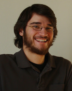
Besides watching a Star Wars marathon and listening to some music, I decided to play around a bit more with Photoshop/Illustrator. I don't know how I came to the decision that I'll try to make a silhouette of my headshot, but I decided that I'll try to make a silhouette of my headshot.


You've seen this picture before, it's over there ---> to the right. It's the headshot I sent in to the job that required me to be clean shaven everyday. I like this picture, because my beard looks good and my hair flows perfectly. This picture would make a simple silhouette because of the amount of contrast it already presents.

I searched for a tutorial of how to do silhouettes, and then followed some steps that got me to just the black and white image. It essentially what I was aiming for.


We get that, just the black on white. It required some touching up of the hair, and if I spent some more time on it, I could get a better representation of how wavy and flow-y my hair can get. But I really wasn't aiming for that. And I don't really have a mouse/setup that could help my precision in that matter.

My next idea was to personalize it a little more, and add some glasses. That led me back into Illustrator where I can easily work with the all-mighty pen tool. The background was the last touch, and I went with some gray of sorts. It's gray. I like gray.
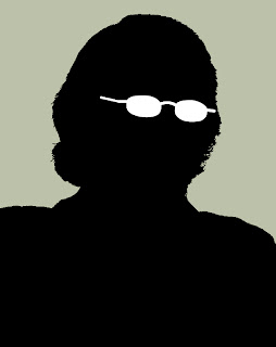


And that is what I ended up with. The glasses look a little too sharp, I think. But if you were to just look at that silhouette without previously seeing the original or knowing who it was, could you guess it was me?

Saturday, November 19, 2011

6th Annual Barth/Wing Bonspiel

Adam and I have gone curling every year since the Winter Olympic Games inspired us back in 2006. We started off with just six people on one sheet and the Annual Barth/Wing Bonspiel has grown ever since. I suggested we make t-shirts for last year's event, but Adam shot that down.

Something he wouldn't be able to stop, however, was an official logo for this year's event. Yup, a semester of training has made me good enough to start making official logos for big-time events. I even did this pro bono.

I had the image in my mind of what it should look like, and I started there. It was just a simple square shaped image, and I wanted text on the top and the side which shared the common "B" from the title. Then I would place the image (which hadn't been decided on then) in the space beneath.

Google is a big help when it comes to images. Searching "curling" or "curling stones" or "that one curling girl that posed nude last year" yielded many results, but still not as many as I would have preferred...

Well I stumbled upon a good enough image of a couple of stones in the house and decided to use that as my template for tracing my own stones in Illustrator. After the primary stone was finished, I was happy with the result, but wanted to see what I could produce with adding two more stones into the mix. I didn't like it as much.

So I balanced out the text and the images into what worked best, and have a black border around the whole thing to help simplify it and keep it together.

You are waiting for what it looks like, eh?


Ta da! It's my first work in Illustrator as a college grad. It helps to keep these skills in order, because that pen tool can be a tricky little fellow to master. I hope you like it and that it inspires you all to go curling!